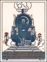
Click on image for detail
#(4) VELO
SPORT BICYCLES:
First edition of 3000
copies, of which 13 are signed.
1970
18" x 24" Three colors
(this edition uses screen tints)
Client:
Peter Rich, Velo-Sport Cyclery, 1650 Grove Street,
Berkeley CA 94703. Telephone (510) 849-0437
Influence:
Early 20th century locomotive illustrations
(Communication
Arts, January/February 1977; One Hundred
Years of Bicycle Posters, Jack Rennert,
Darien House, 1973; Le Machine Celibi,
Edited by Jean Claire & Harald Szeemann,
Rizzoli, 1975) (facsimile)
Second edition
of 2000, of which 100 copies are signed. 1973
Five colors Alteration of text, signed in the
plate
Third edition
of 4943 of which 100 copies are signed 1-100,
26 are signed A-Z as artist's proofs, and four
sets are signed as progressives. Artwork modified,
color separations remade May 1, 1975 Five colors
Artwork modified, color separations remade A-Z:
Artist's own use. All signed copies to The Poster,
San Francisco May 1, 1975 Five colors Artwork
modified, color separations remade A-Z: Artist's
own use.
A limited number of these unsigned prints are available for sale now from the Vello Sport website.