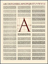
Click on image for detail
#(16)TYPE SPECIMEN BROADSIDE
Edition of 100 copies of which none are signed.
1972 One color 18" x 24"
Client: Saint Hieronymus Press
From time to time I've curled up to read a book but have found it such heavy going that I've set it down and forgotten it. Years later I've tried it again in a different edition, and have discovered the book quite compelling, and have eagerly devoured it, sometimes in a single sitting. Have I brought a new and eager swain to the same old book? Has the book itself matured in some complex cultural way?
As a printer, I have a third explanation. Typography, leading, selection of typeface, quality and color of paper, presswork, ratio of text to page, gutters and margins, the binding. All those unconscious things actually constitute the book you hold in your hand. You think it's the author who's not getting through; or that you're too dull to grasp the concepts; or the story makes its halting way across the page; flags, and gasping gives up the ghost before page fifty.
But it is also possible, even likely, that the typeface is wrong, or too big or too small; the lines are too close together; the paper is too white and shiny and glares in your eyes; your thumb covers the bottom lines of text; the text runs into the gutter, and the whole concatenation actively resists being read, frustrating the author's desire to speak and the reader's desire to listen.
My business as a printer is to make sure that the book you hold in your hand desires to be read; eagerly pours out its honeyed message; begs to be held and caressed, and lovingly treasured. My work is the Black Art of printing, and when it's done right, the magic isinvisible.
"Type well used is invisible as type, just as the perfect talking voice is the unnoticed vehicle for the transmission of words, ideas," Beatrice Ward, "The Crystal Goblet, or Printing Should Be Invisible," speech delivered before the British Typographers Guild, 1932